Little Earthling
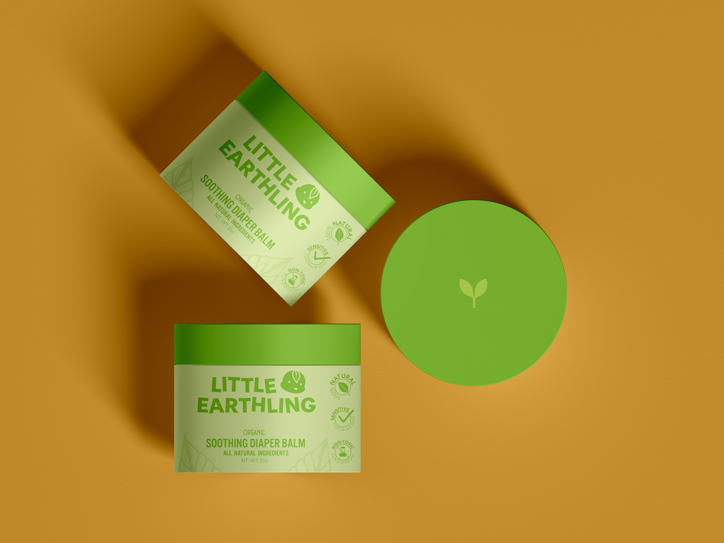
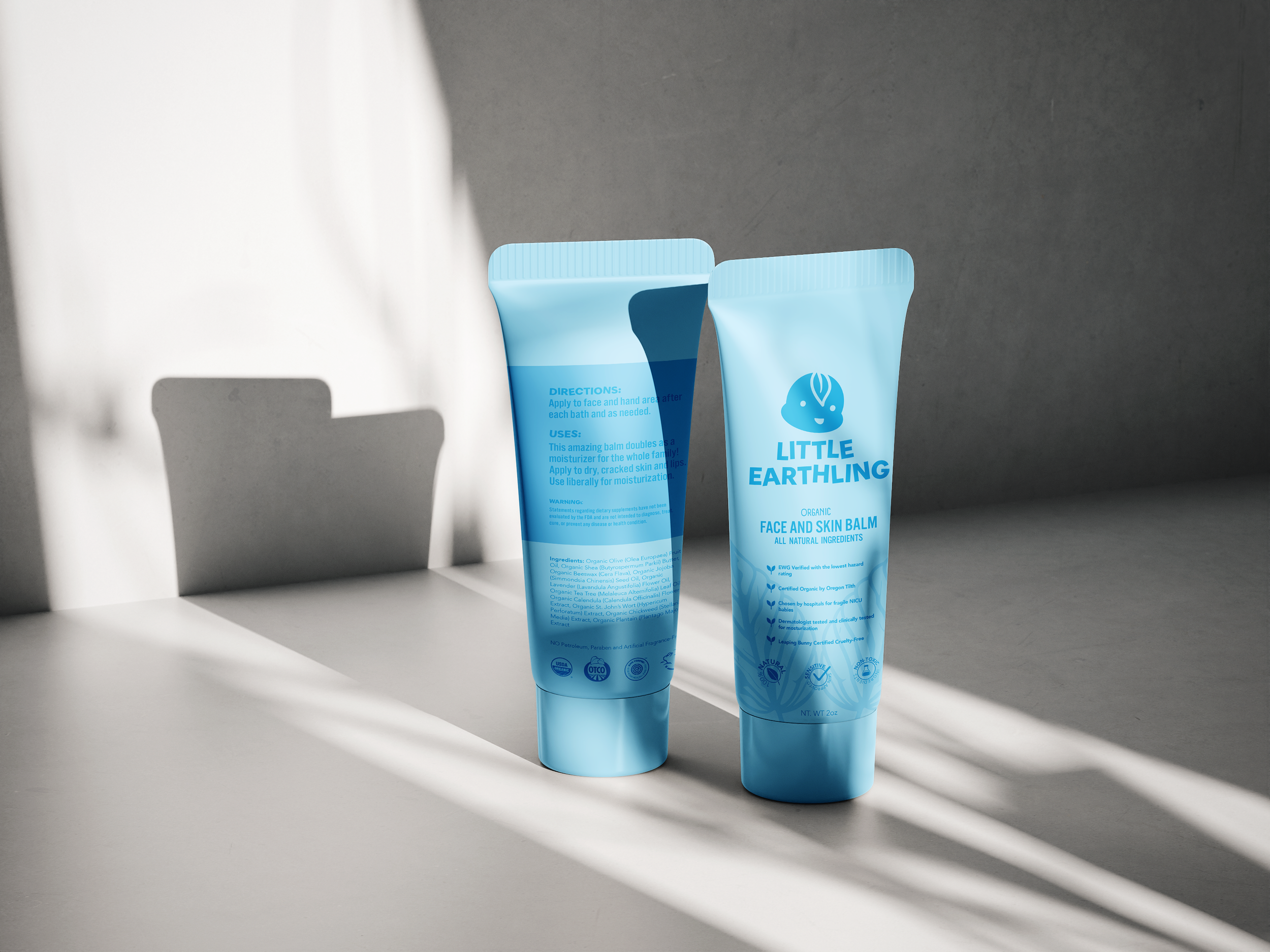
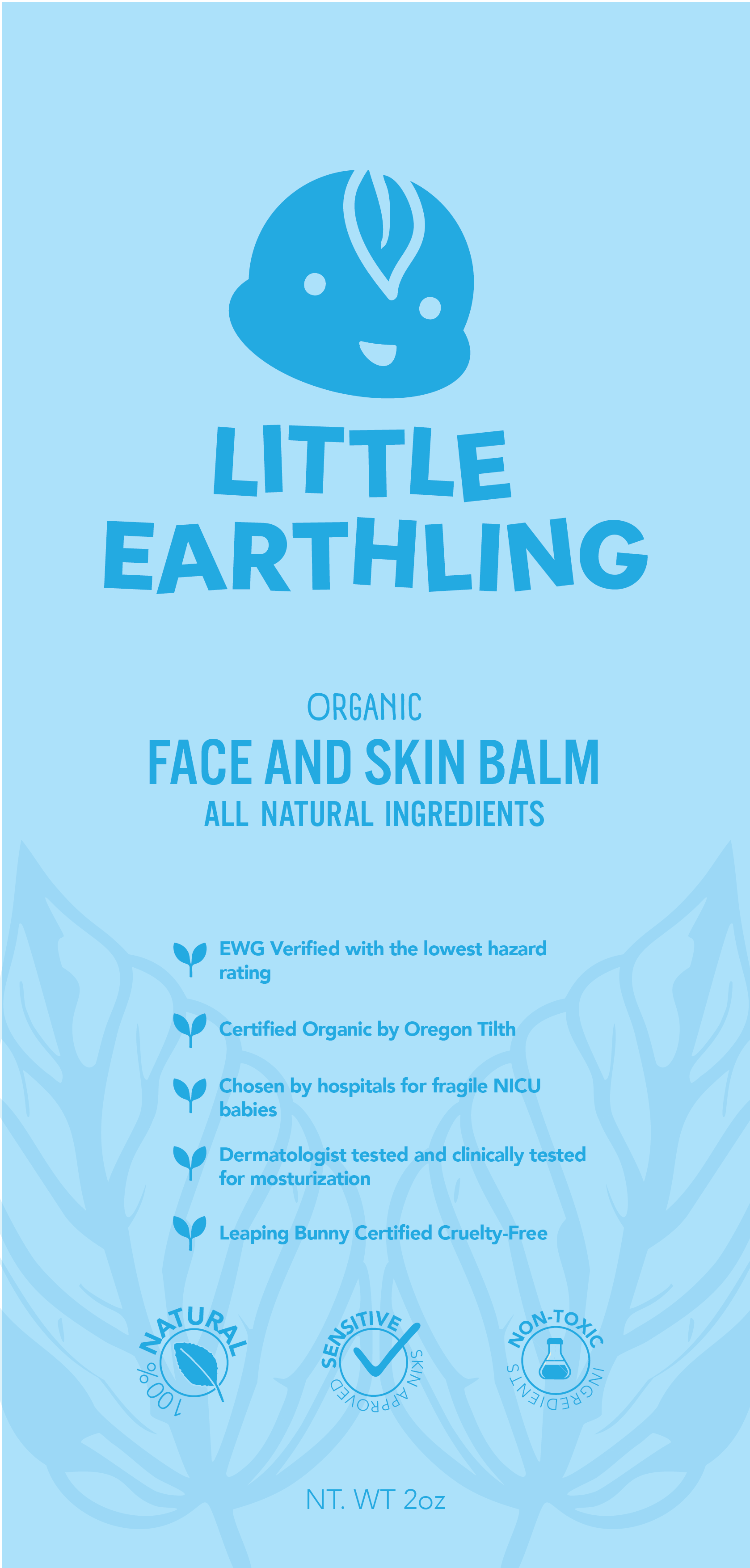
Little Earthling, a conceptual children’s brand specializing in baby diaper cream and other topical products, embodies a natural and earthy essence with a playful baby vibe. The logo features a charming illustration of a baby with elements of nature, emphasizing the brand's commitment to gentle and organic ingredients. A soft and earth-toned color palette, including soothing greens, conveys a sense of natural purity. The typography combines a friendly sans-serif font with a playful tilt, enhancing the overall nurturing identity. Imagery showcases happy babies and caring parents, highlighting the products' efficacy and the brand's dedication to creating a safe and enjoyable experience for little ones. Packaging design is both practical and visually appealing, using eco-friendly materials to align with the brand's natural ethos. Marketing collateral and an inviting online presence convey the heartwarming essence of Little Earthling, inviting parents to embrace the brand's natural and playful approach to baby care.

